


The Process
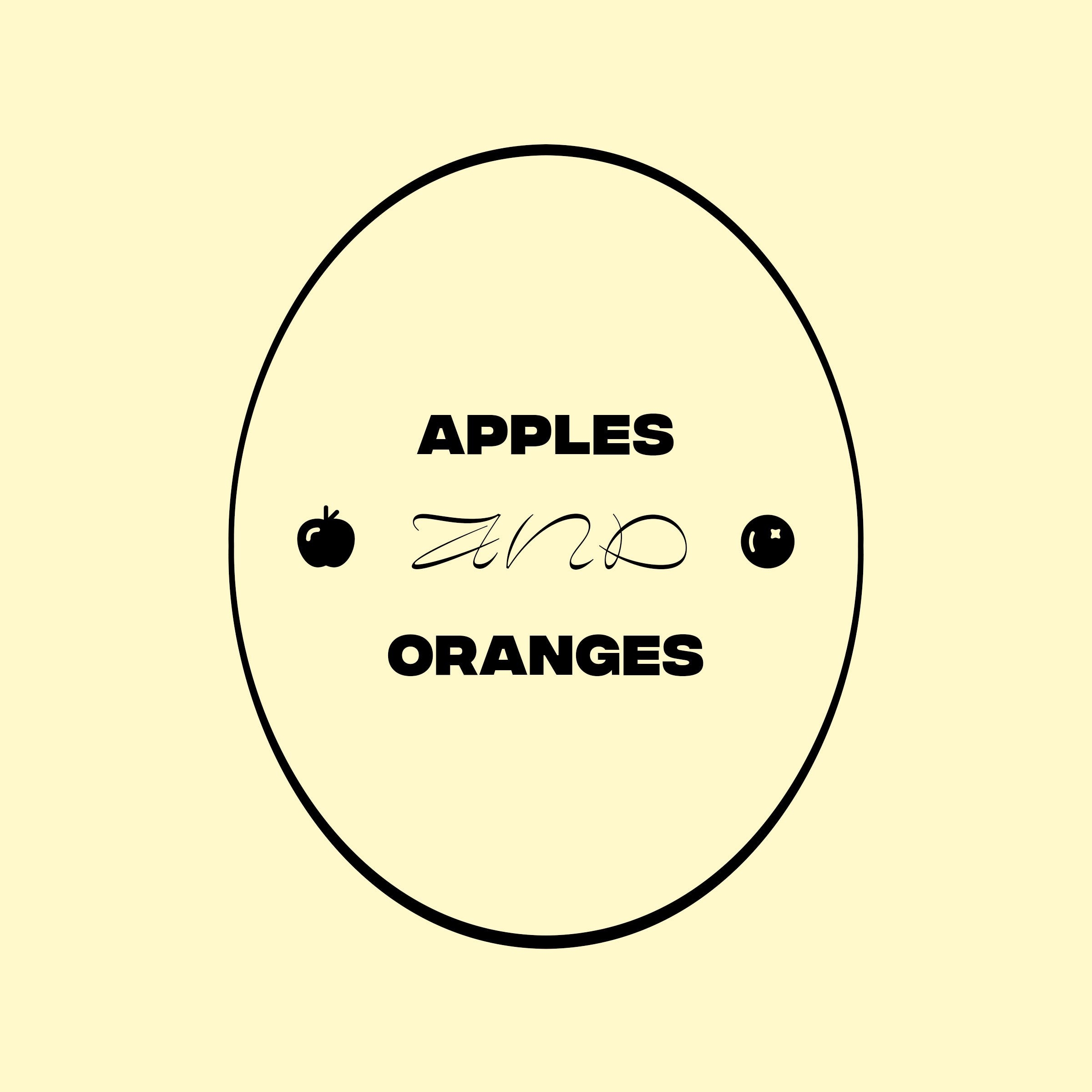
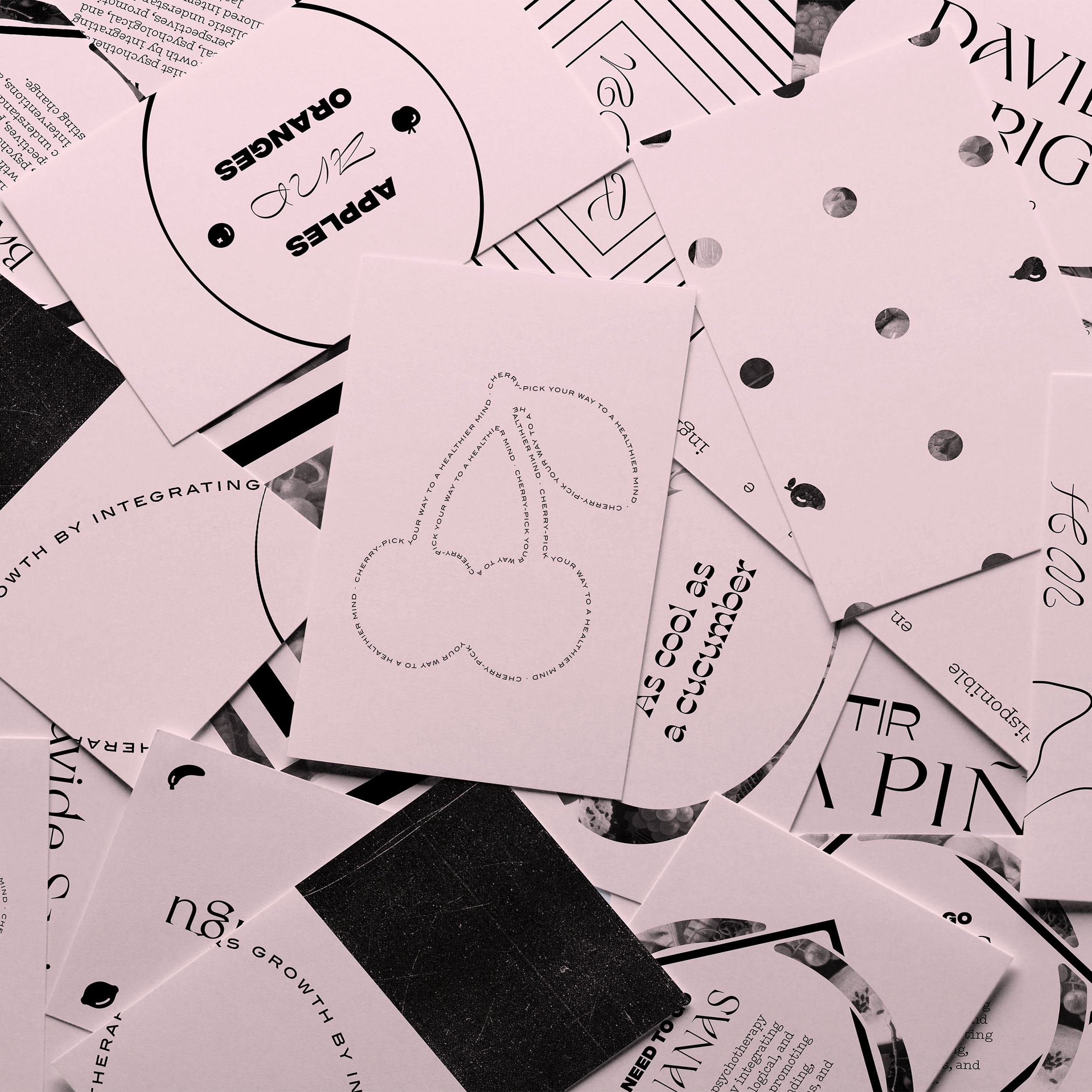
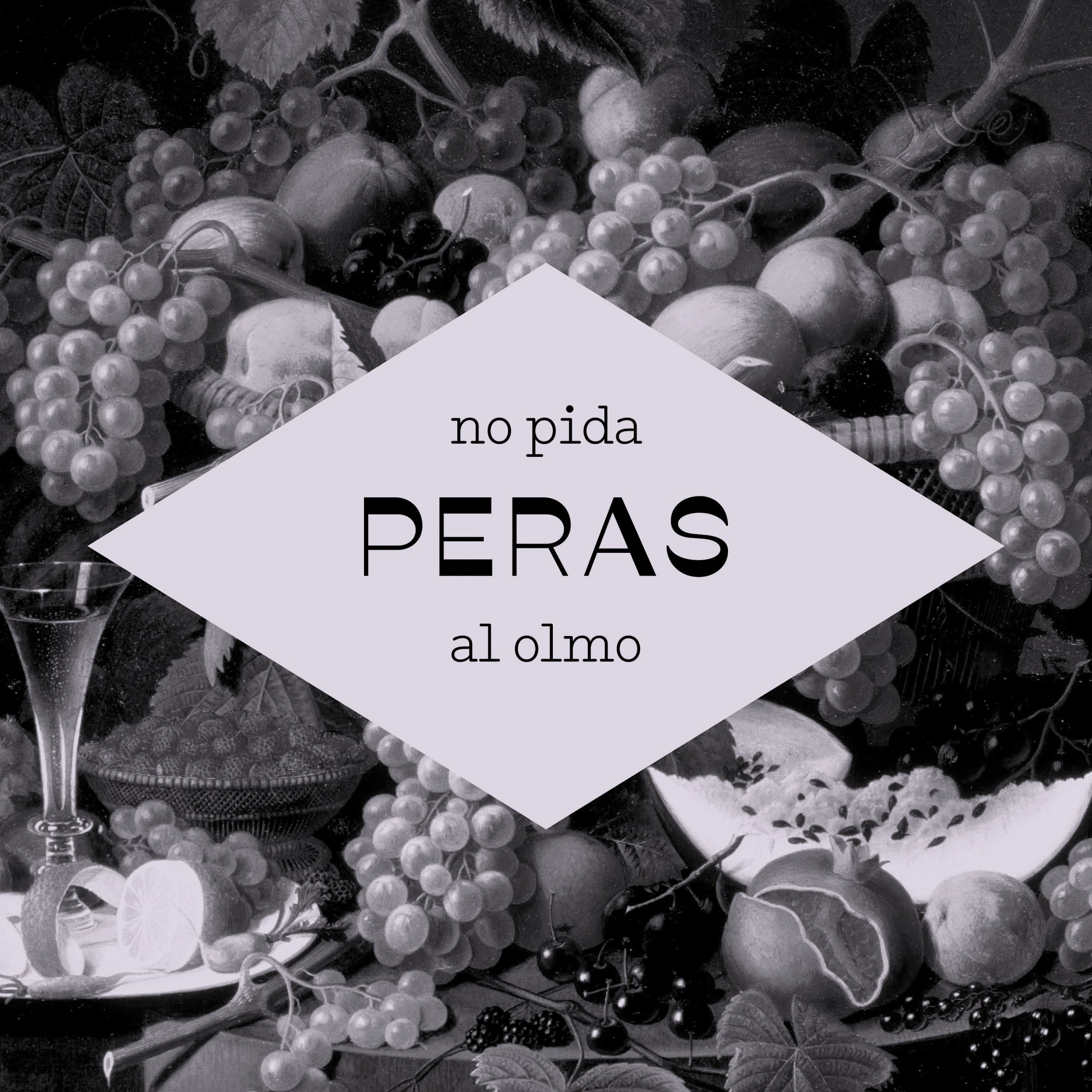
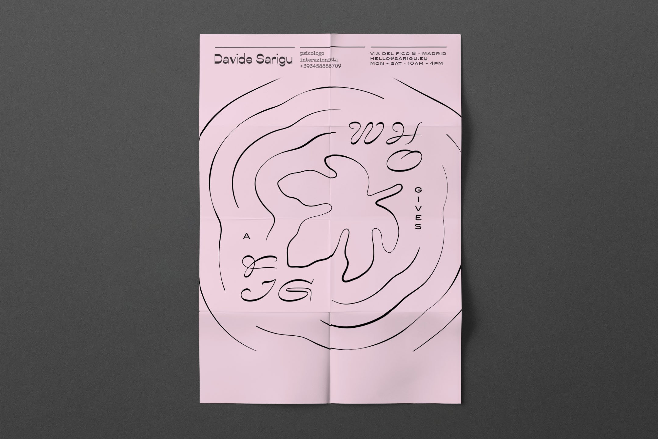
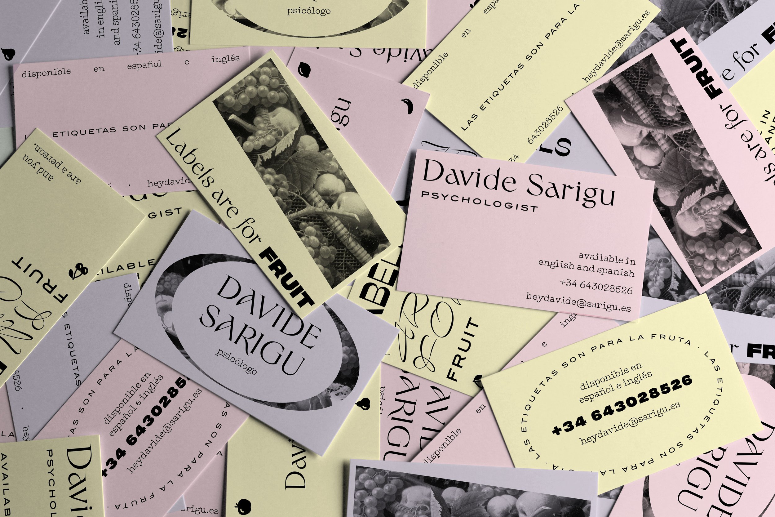
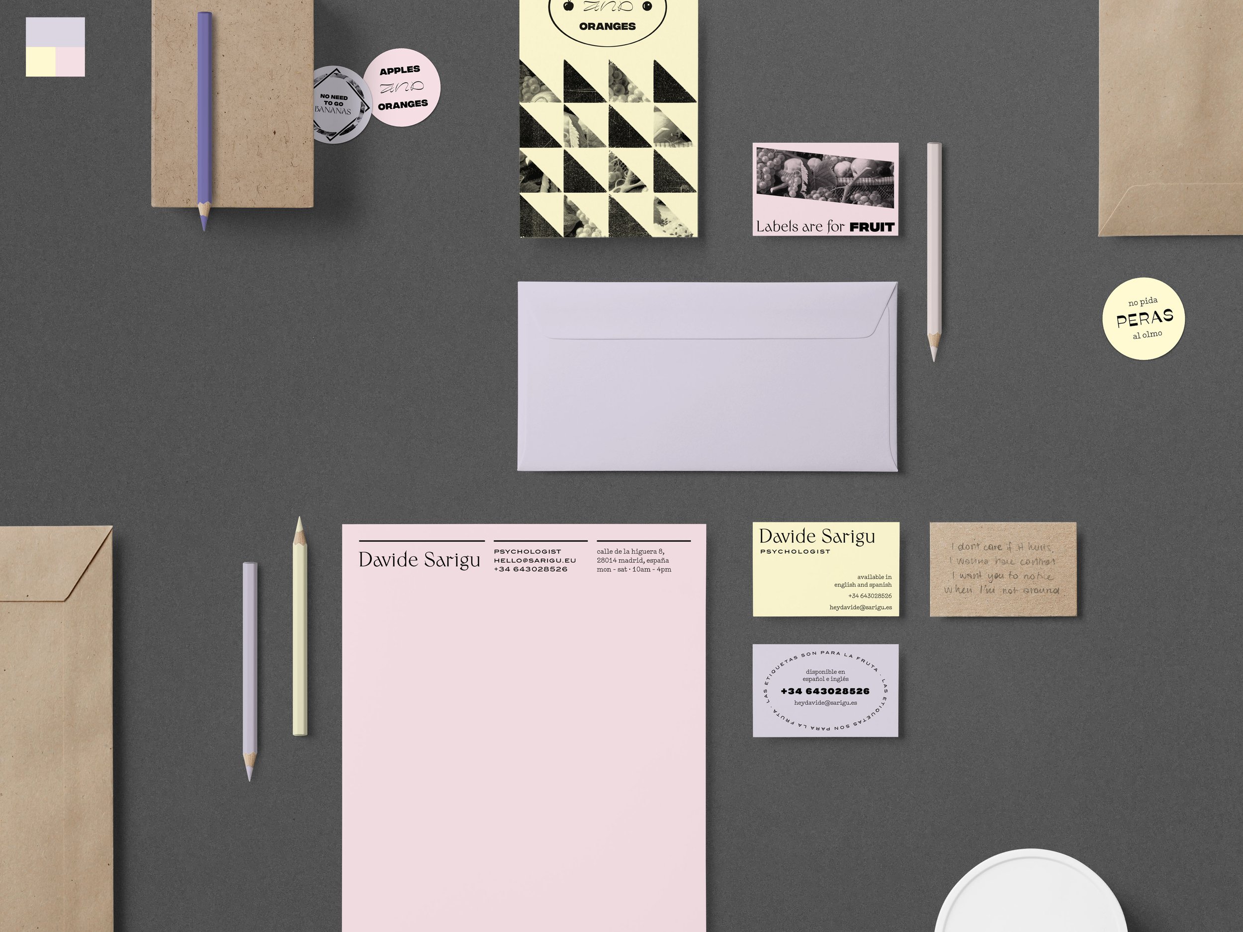
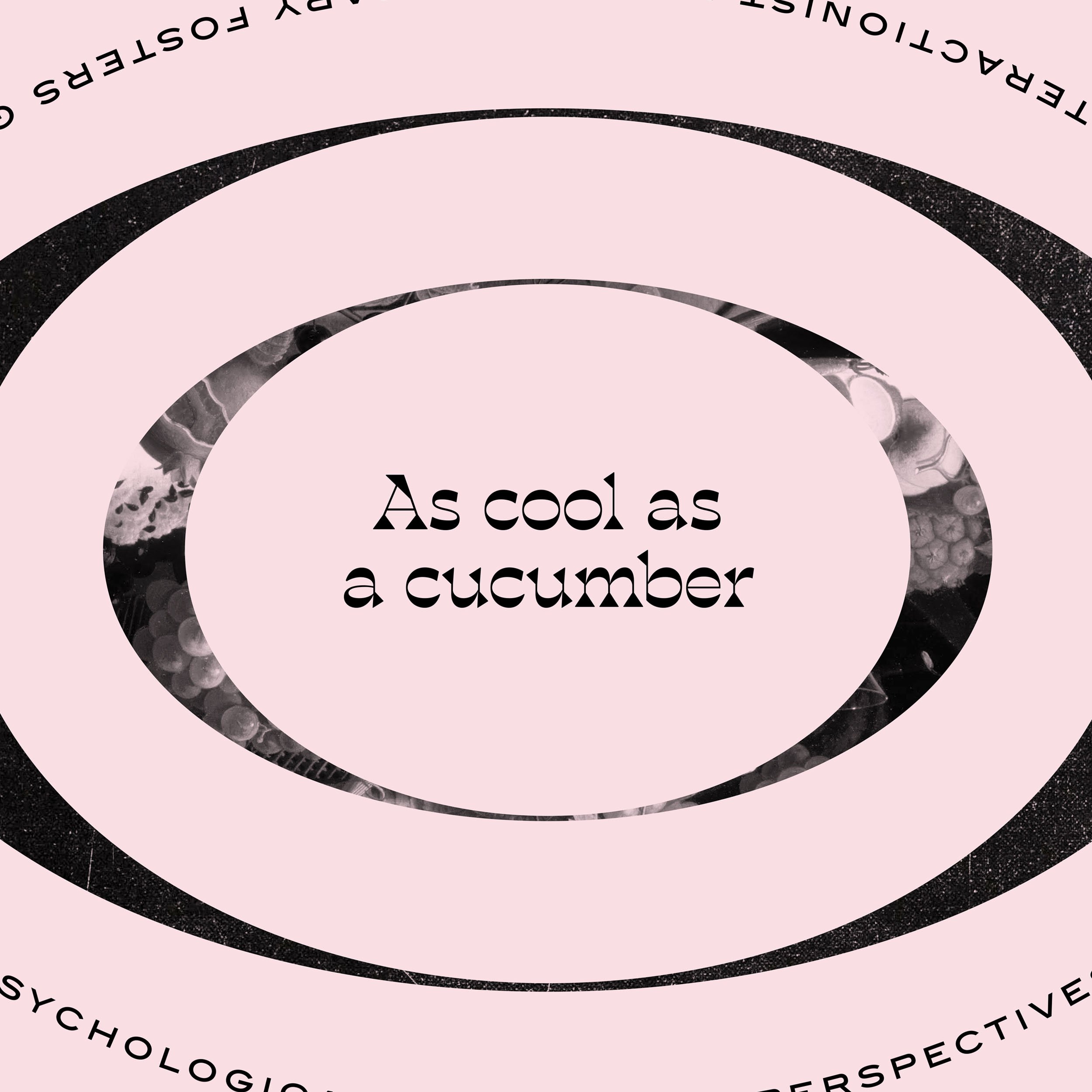
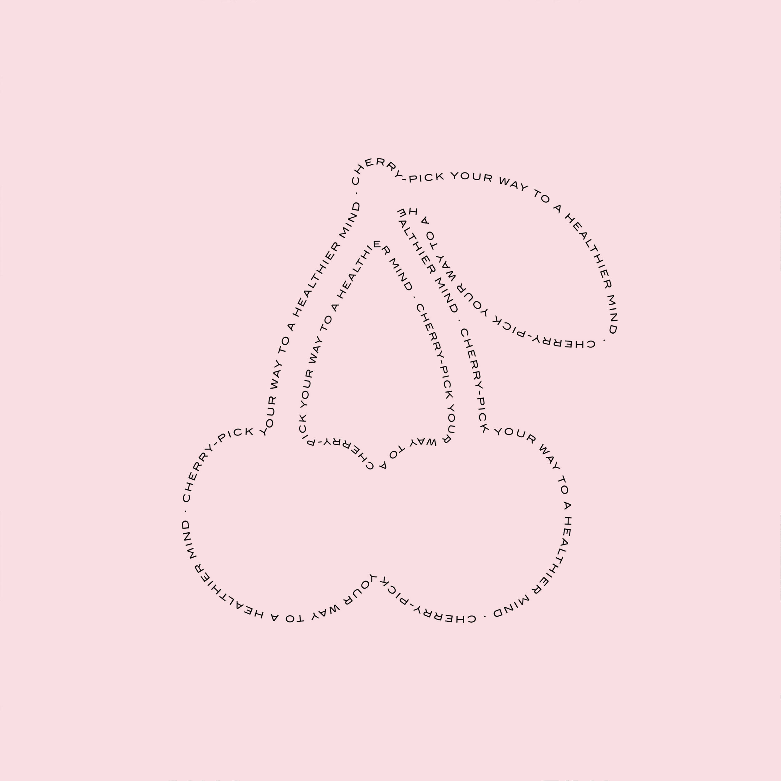
At the heart of Davide's identity is the guiding idea: "Labels are for fruit." This phrase encapsulates his mission to foster authenticity and to value idiosyncrasies.
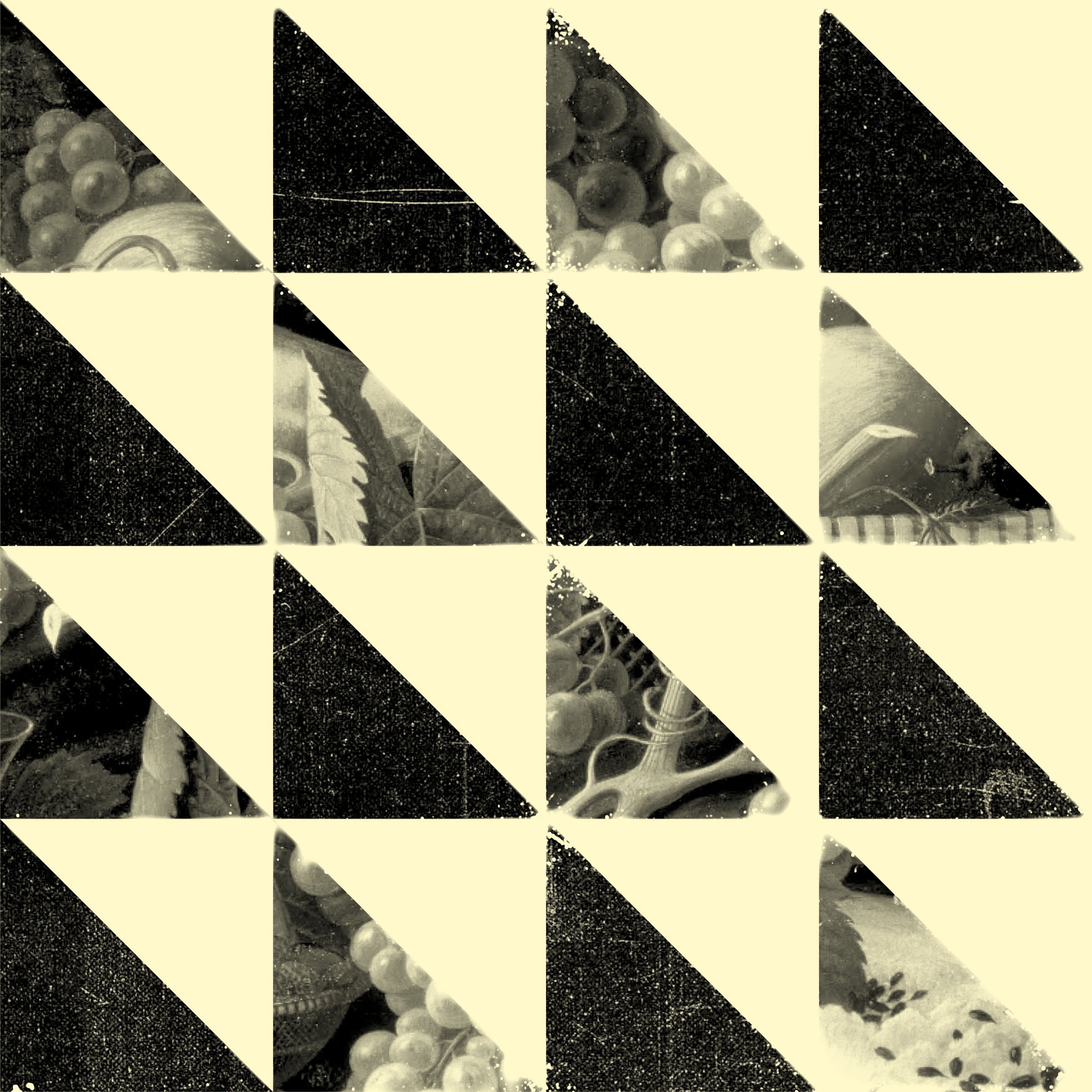
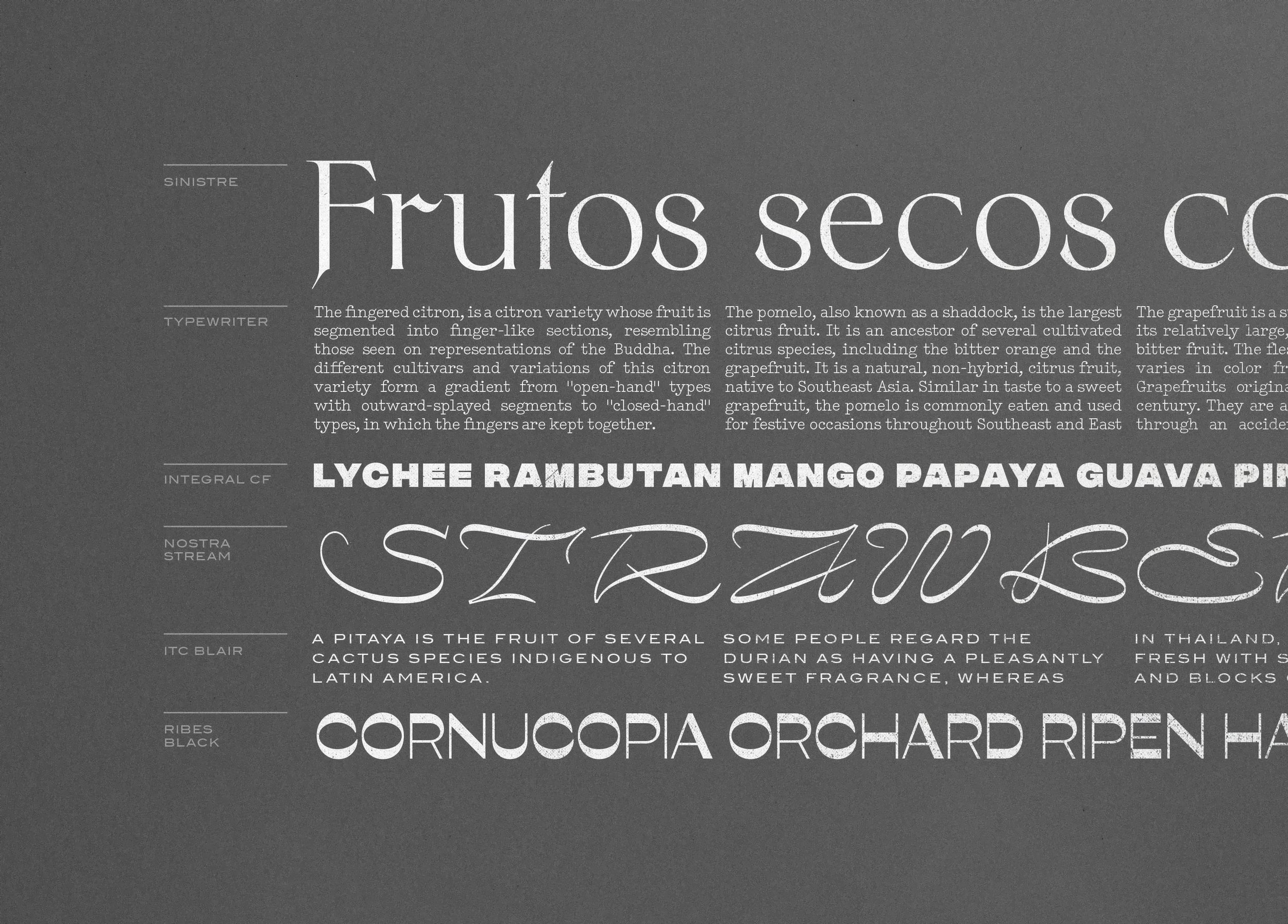
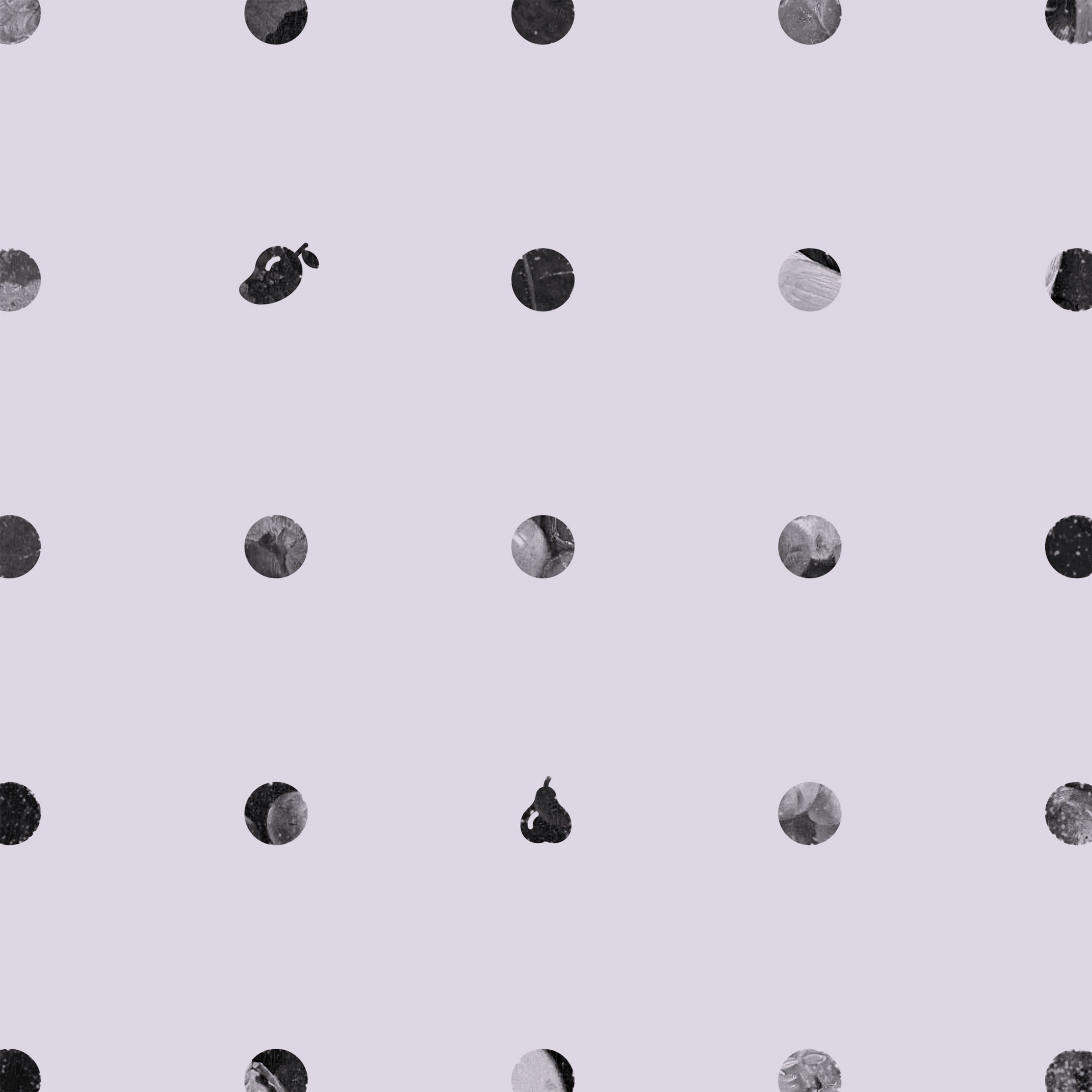
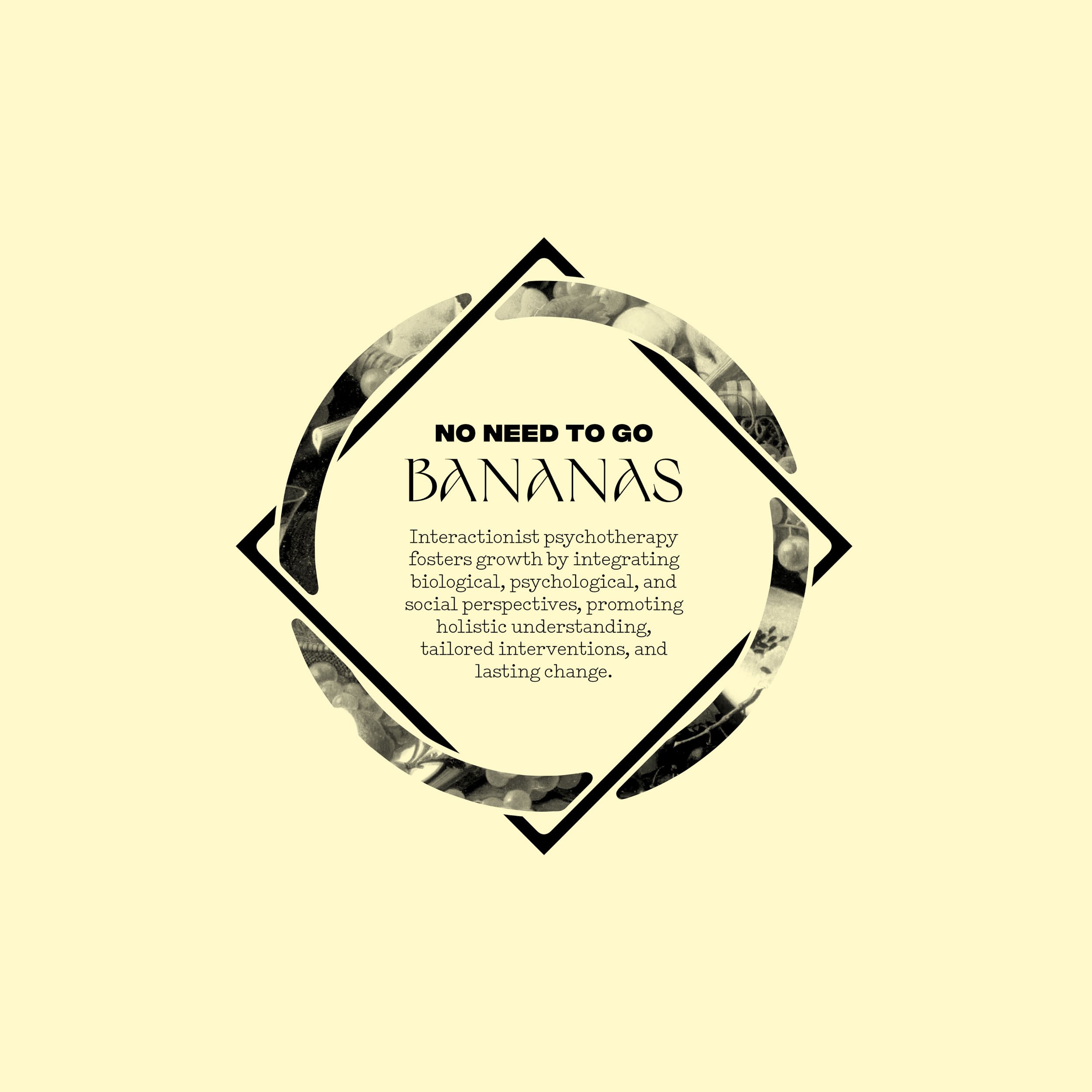
Inspired by idiomatic expressions and the symbolic richness of fruit, the visual language features still-life oil paintings, minimal fruit icons, and eclectic typography that defies convention, echoing his values.
Eclectic Precision
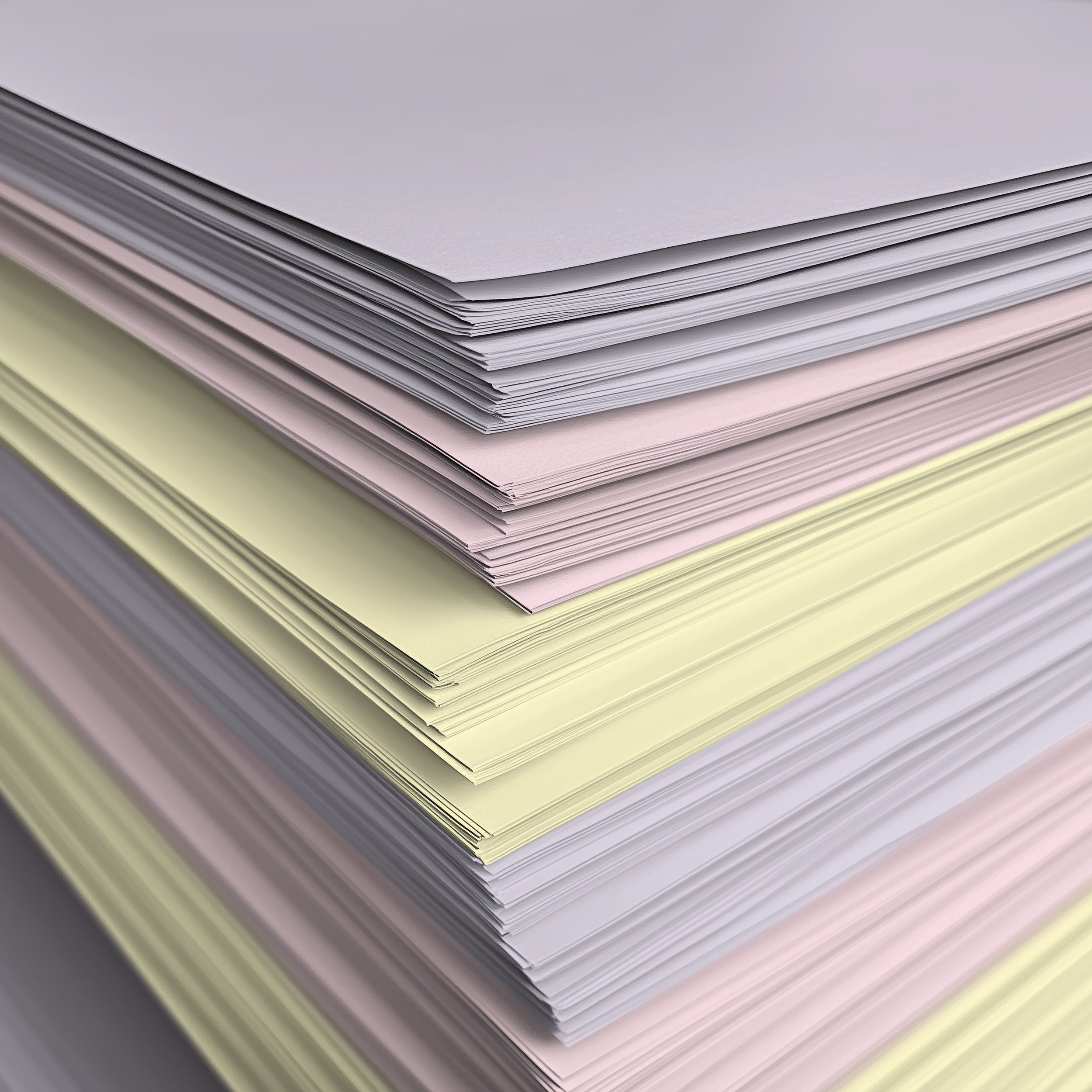
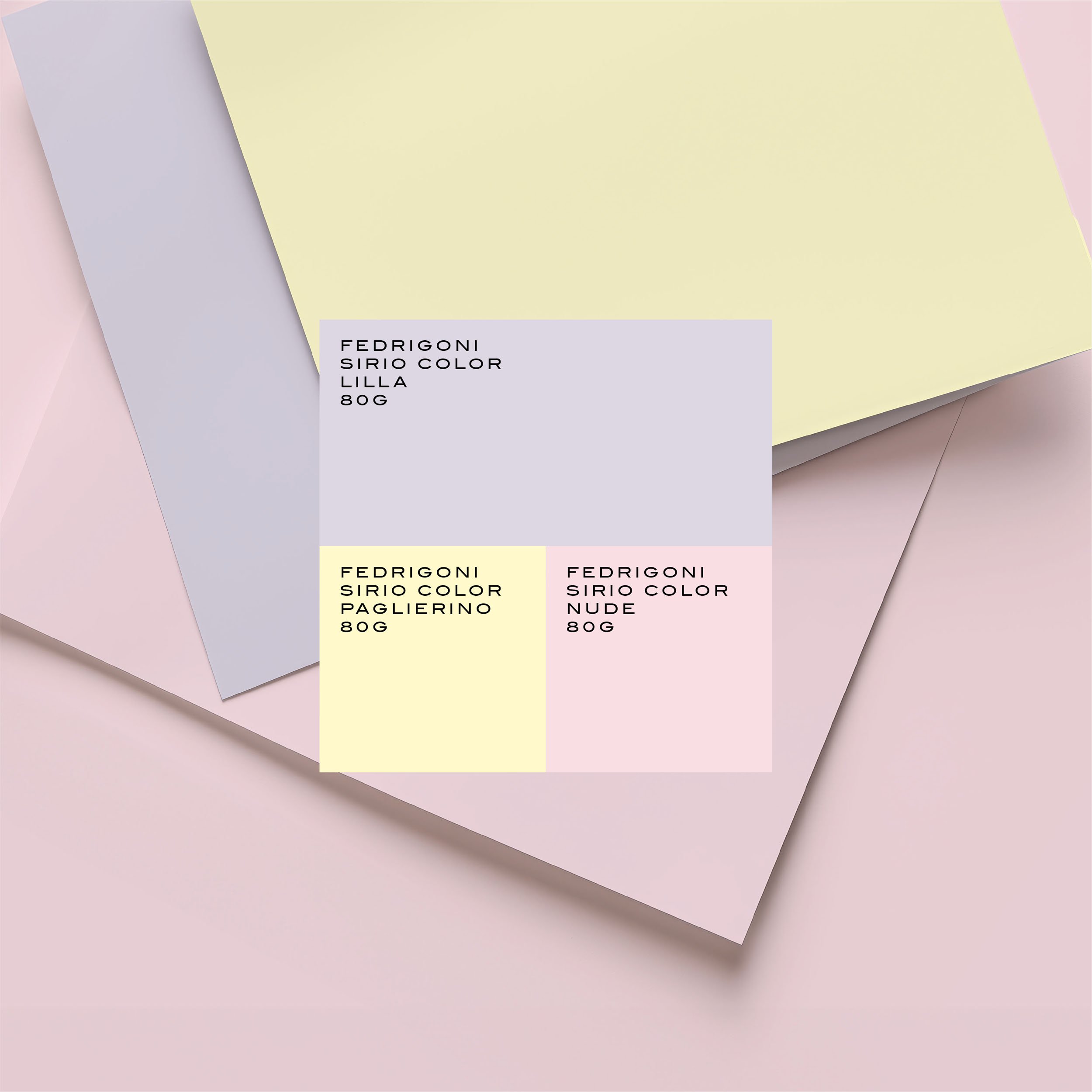
The identity's color palette draws inspiration from the constraints of local print shops, embracing pastel-colored paper backgrounds to deliver warmth.
This black-and-white aesthetic, reminiscent of photocopied zines, is elevated through bold graphics and playful typography, ensuring a distinct yet approachable visual language that balances practicality with creativity.