


The Process
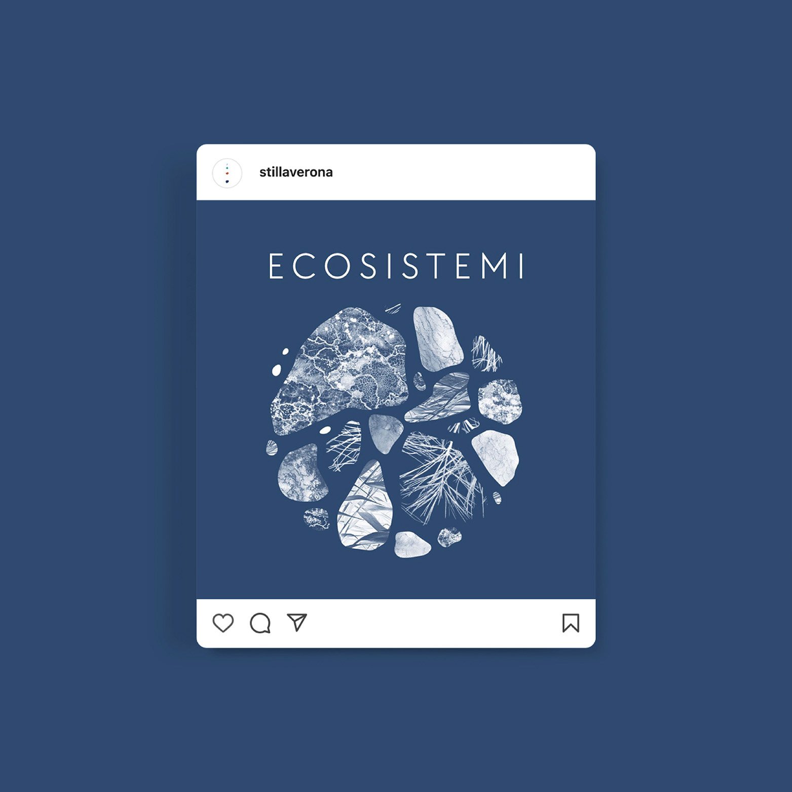
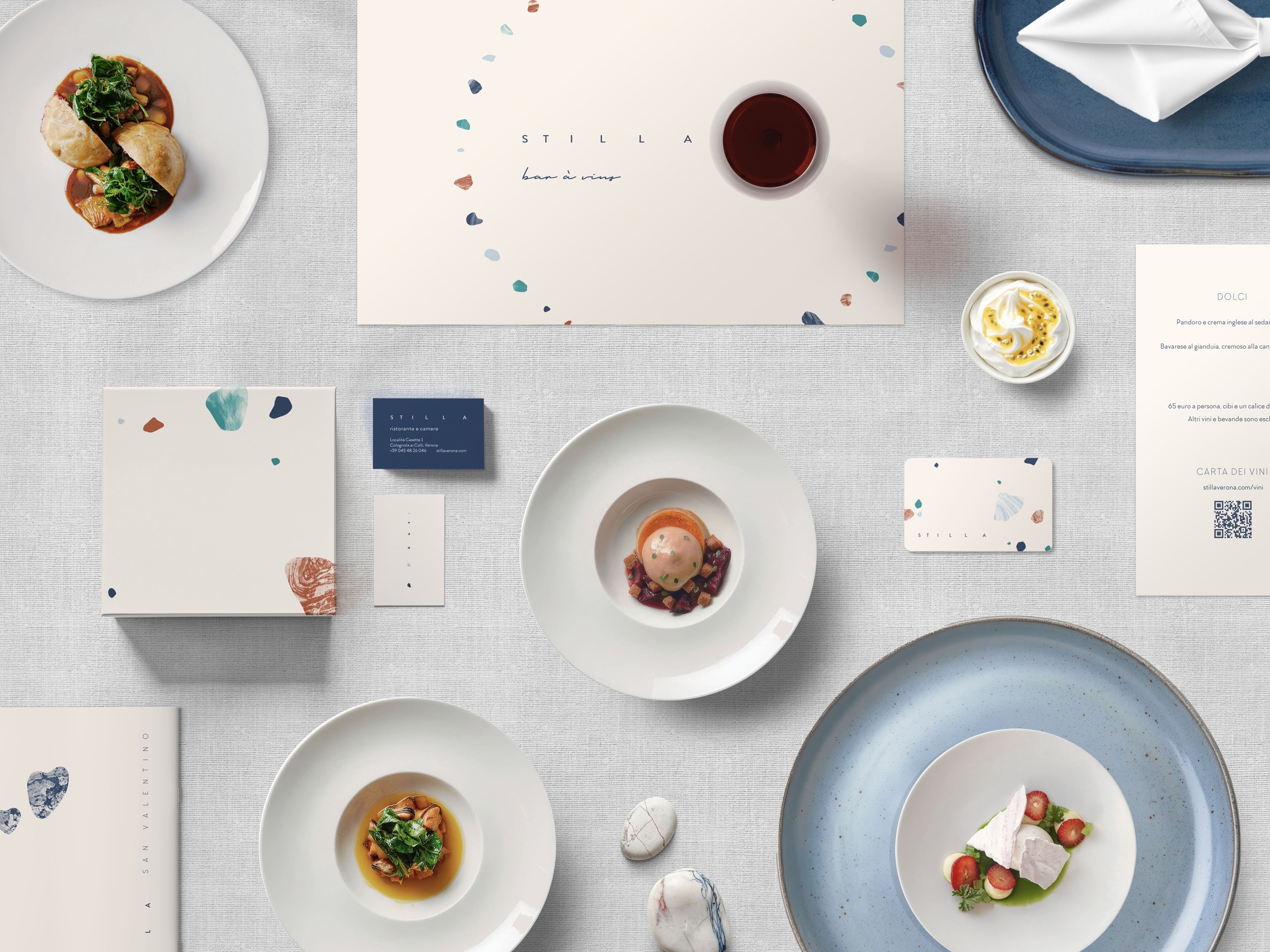
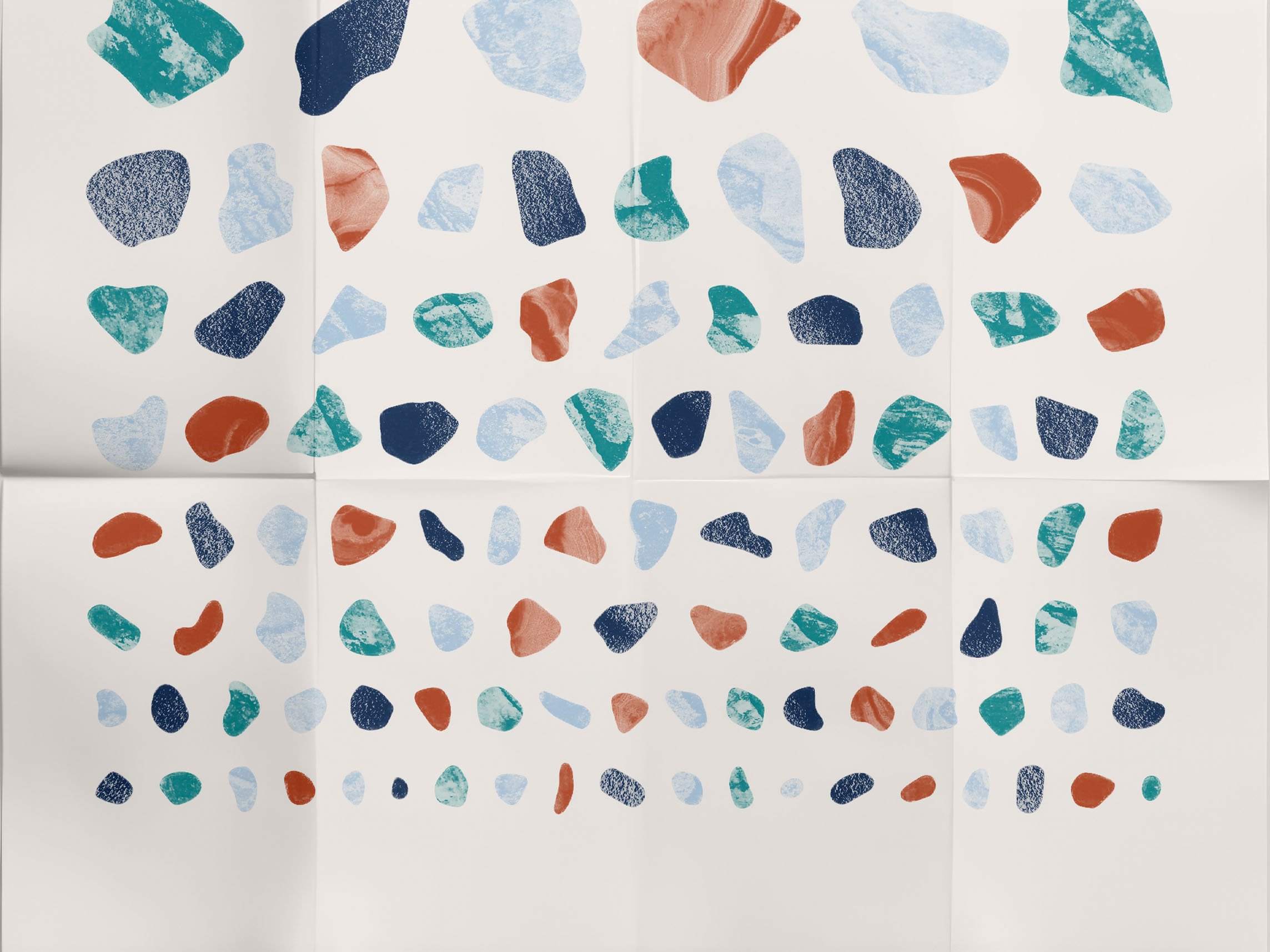
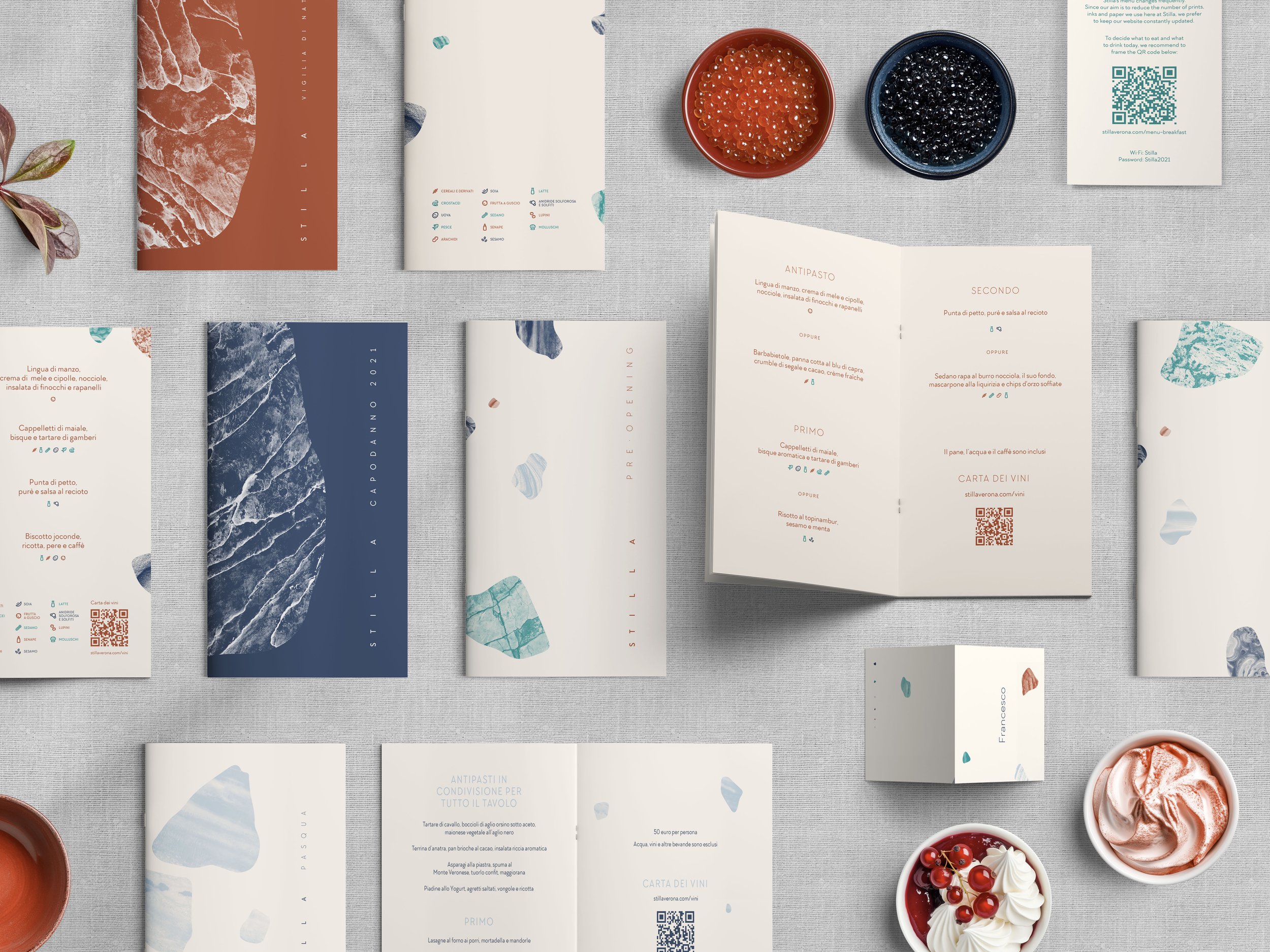
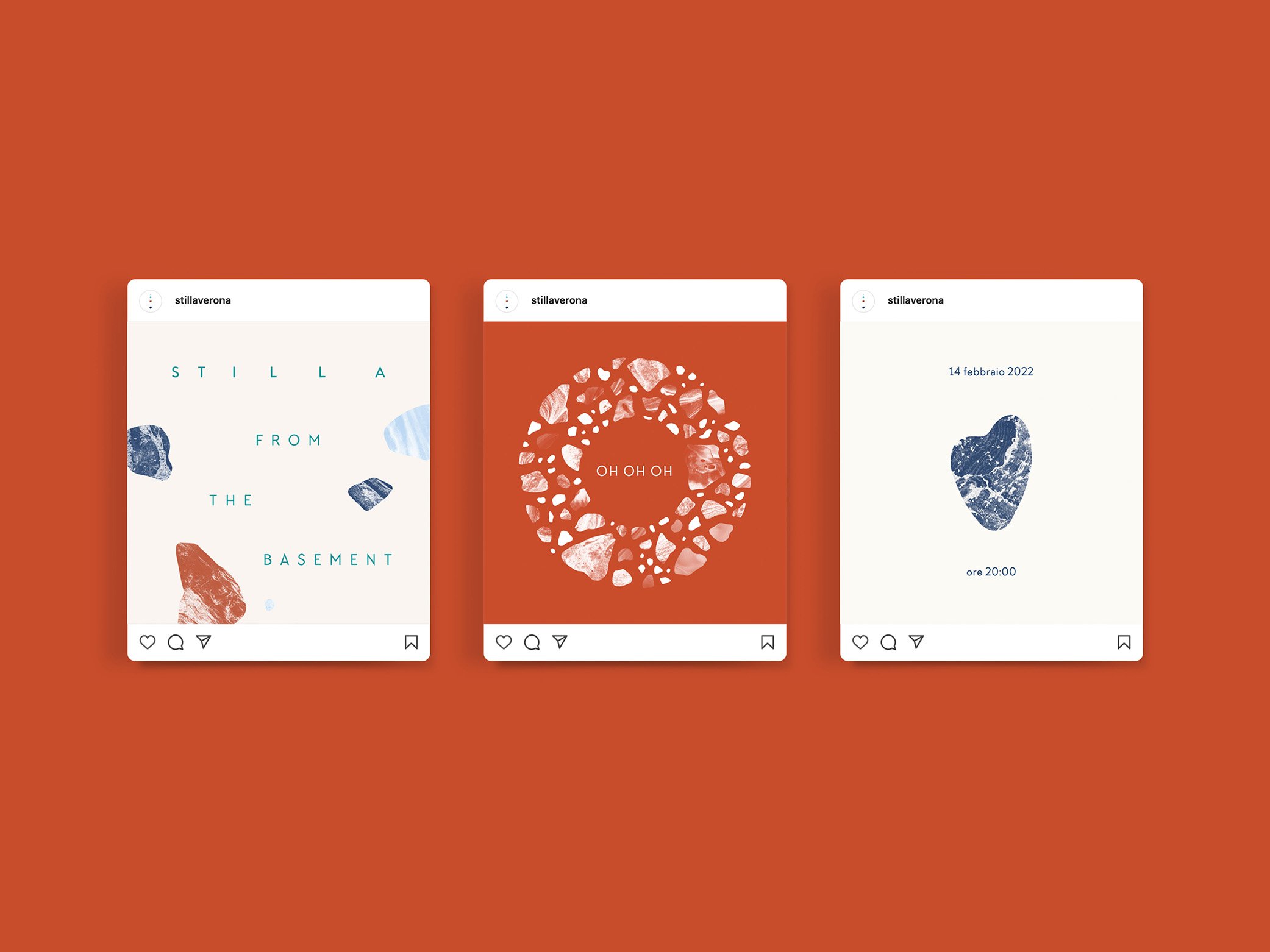
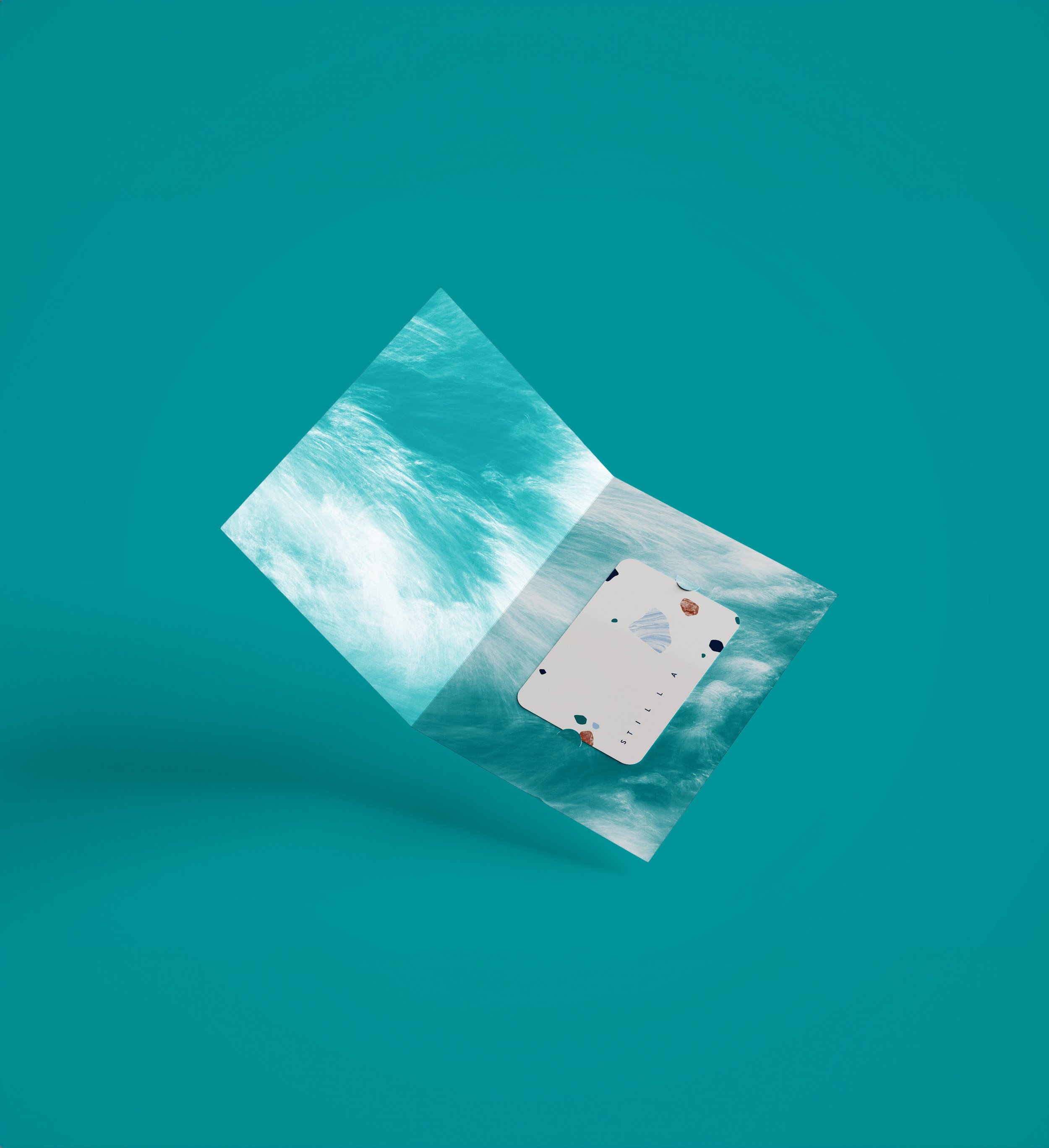
The starting point was the restaurant's name—Stilla, meaning "waterdrop" in Italian. A central symbol embodies the restaurant's personality: the sturdy form of a pebble juxtaposed with the gentle, cascading motion of a falling waterdrop.
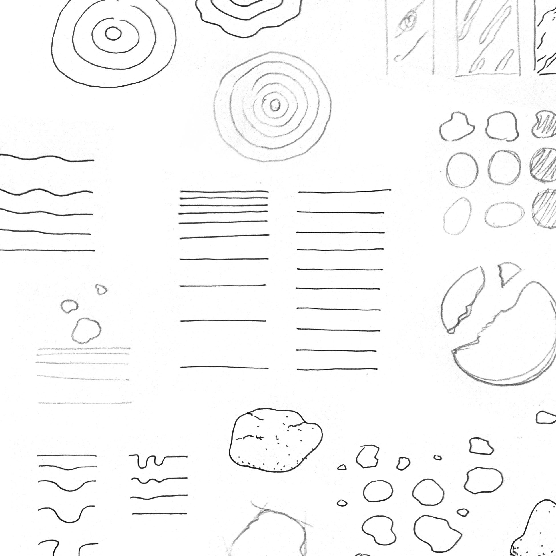
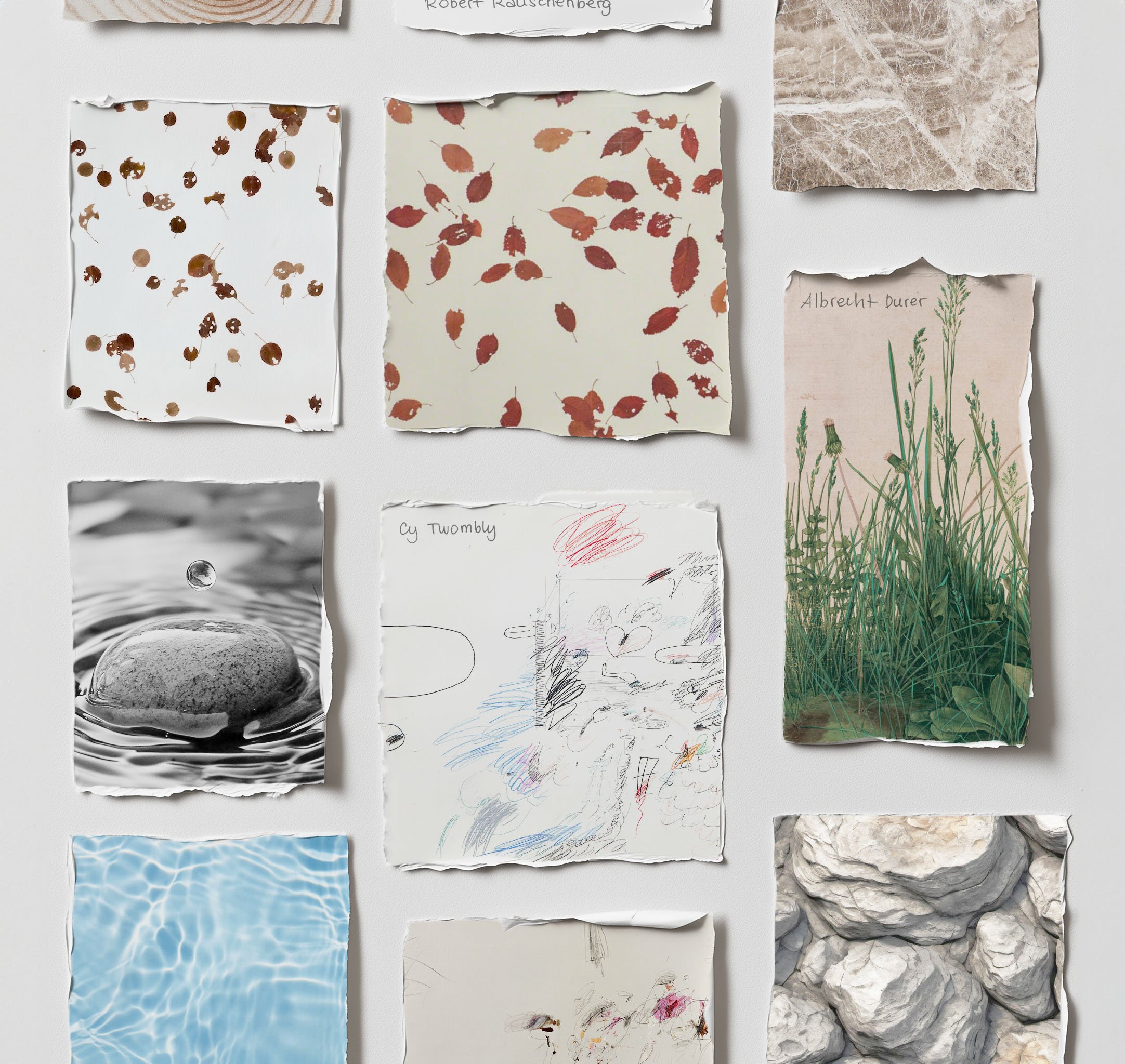
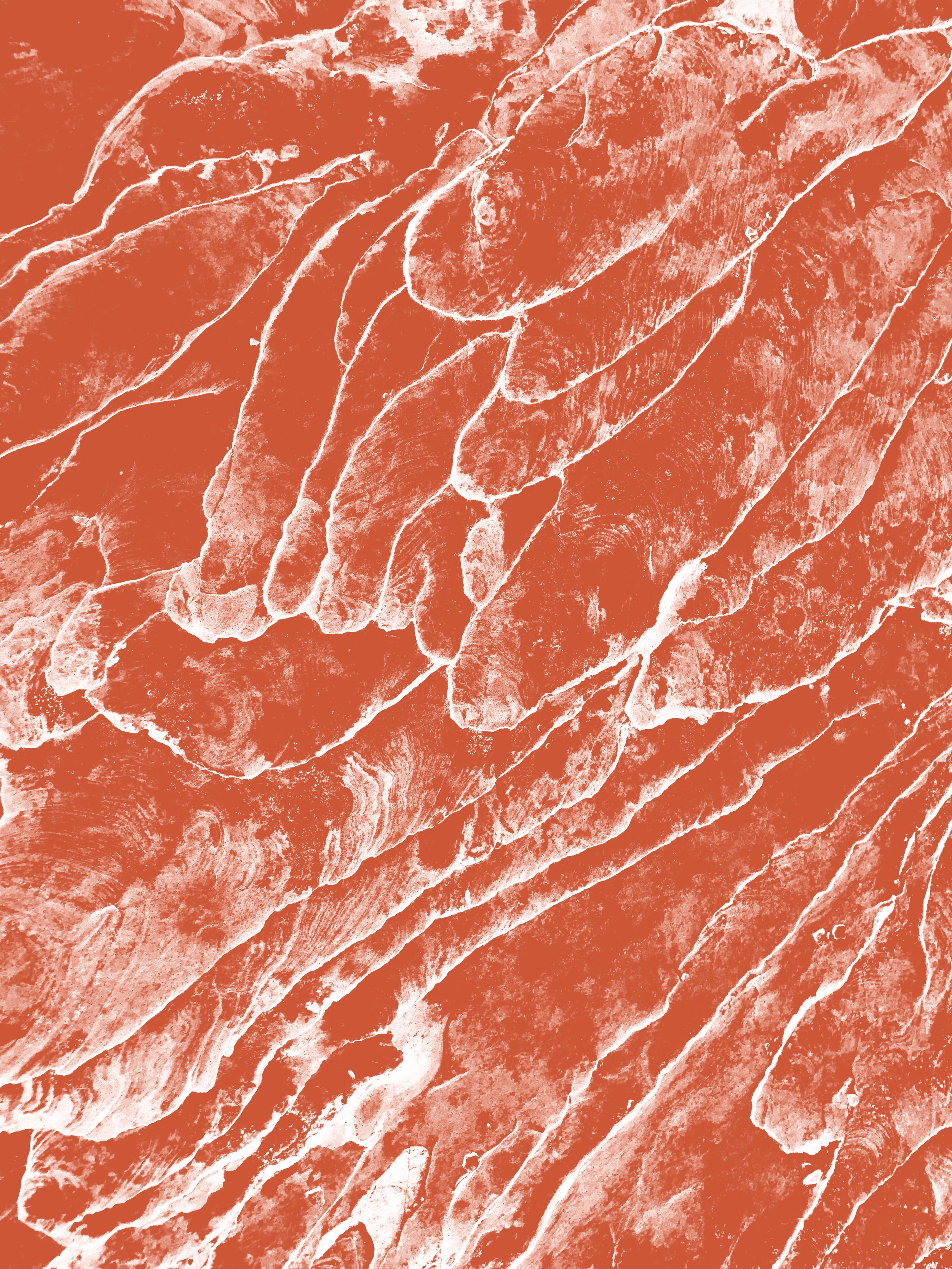
Through moodboarding activities, informed by both style and content, gritty natural textures emerged to convey authenticity, while negative space and scattered shapes were used to evoke subtlety.


Balancing Restraint with Warmth
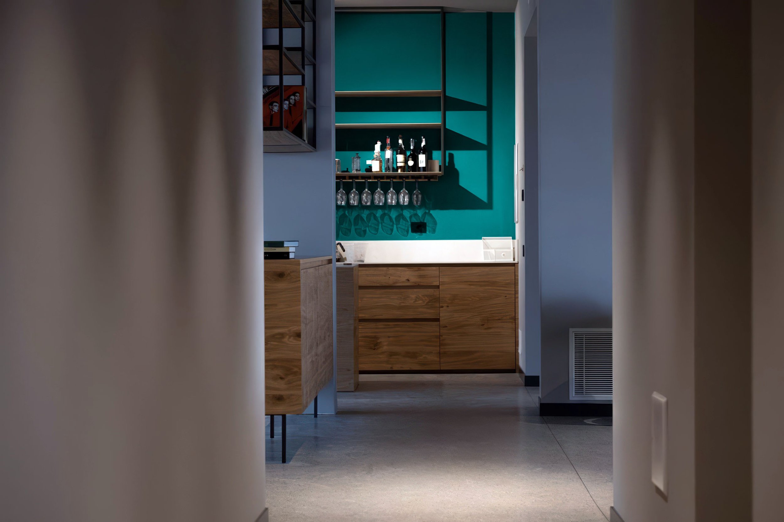
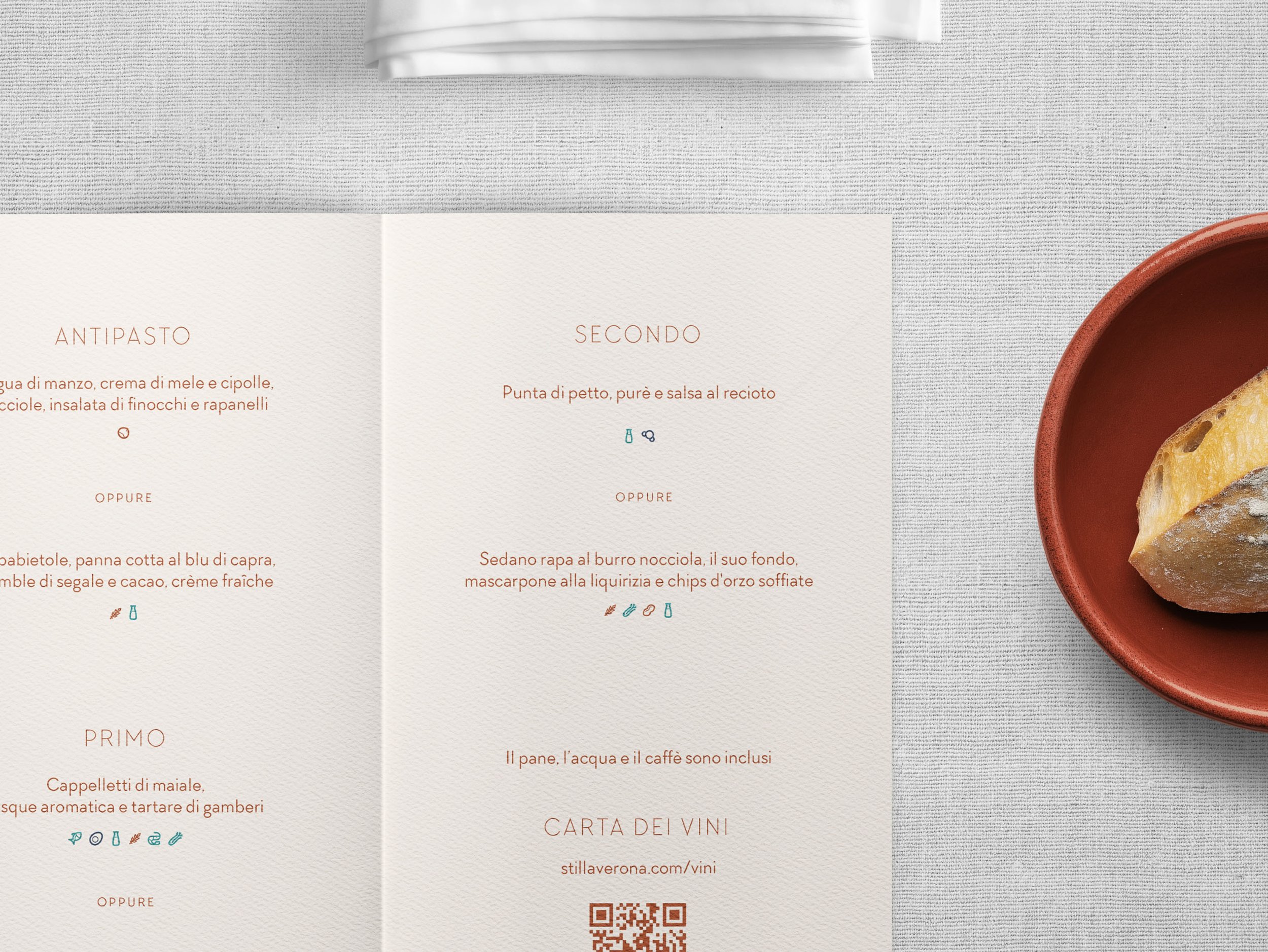
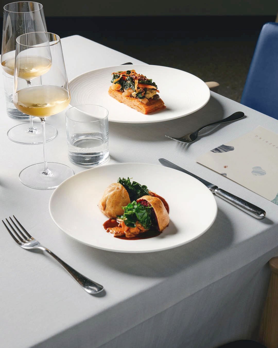
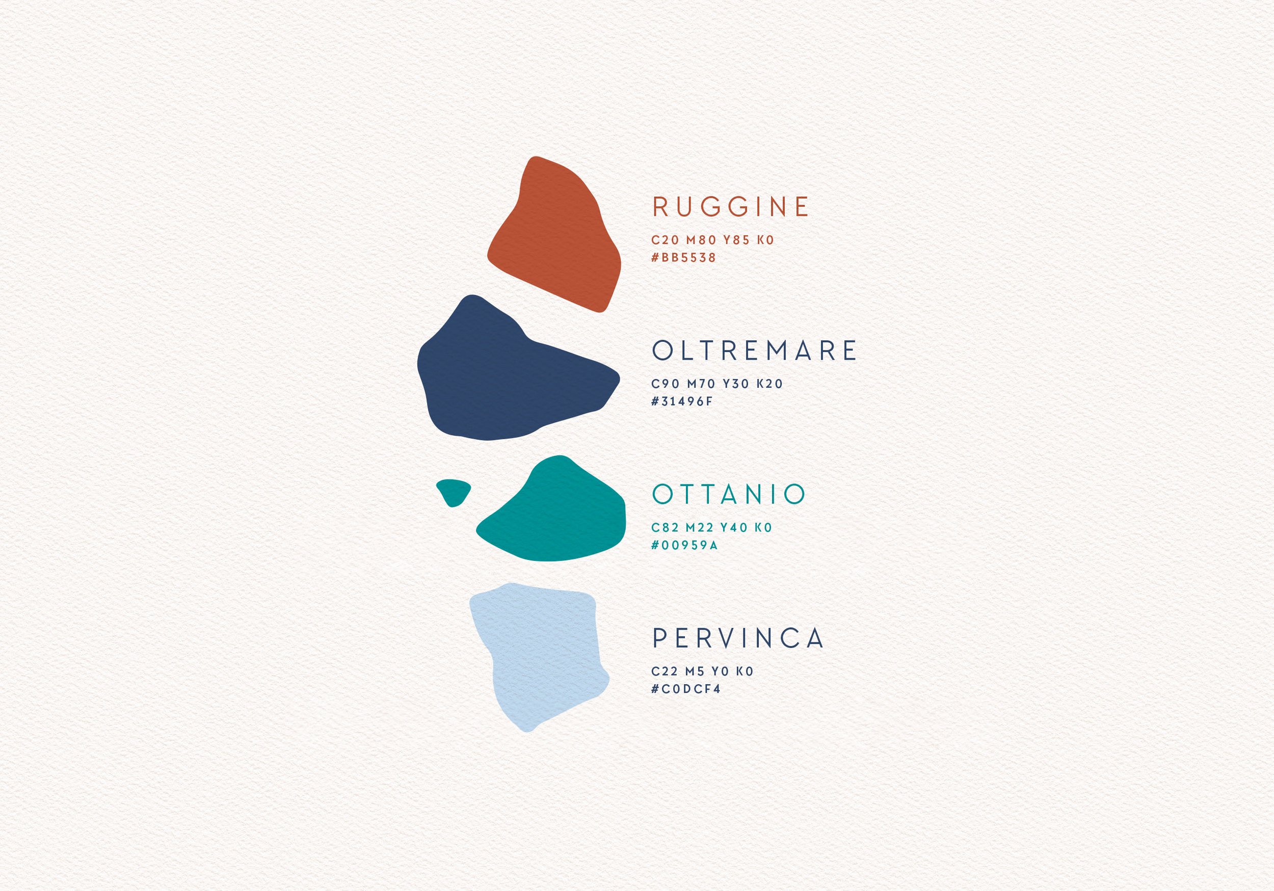
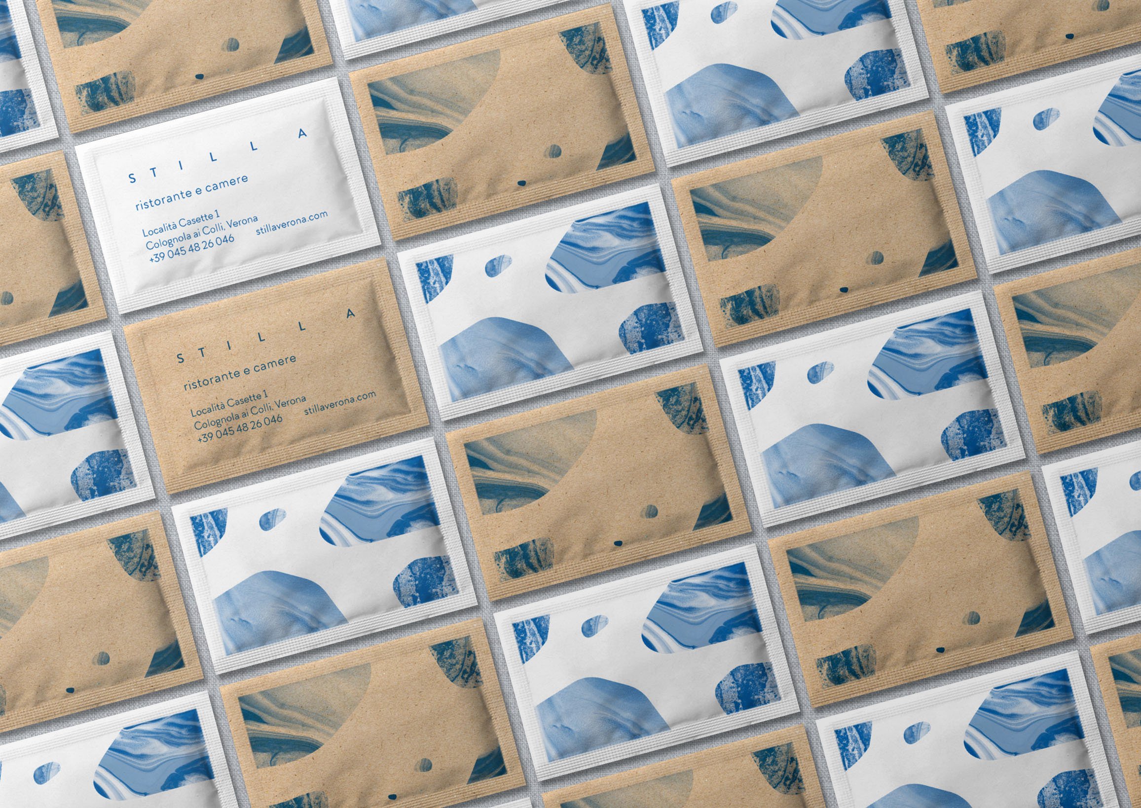
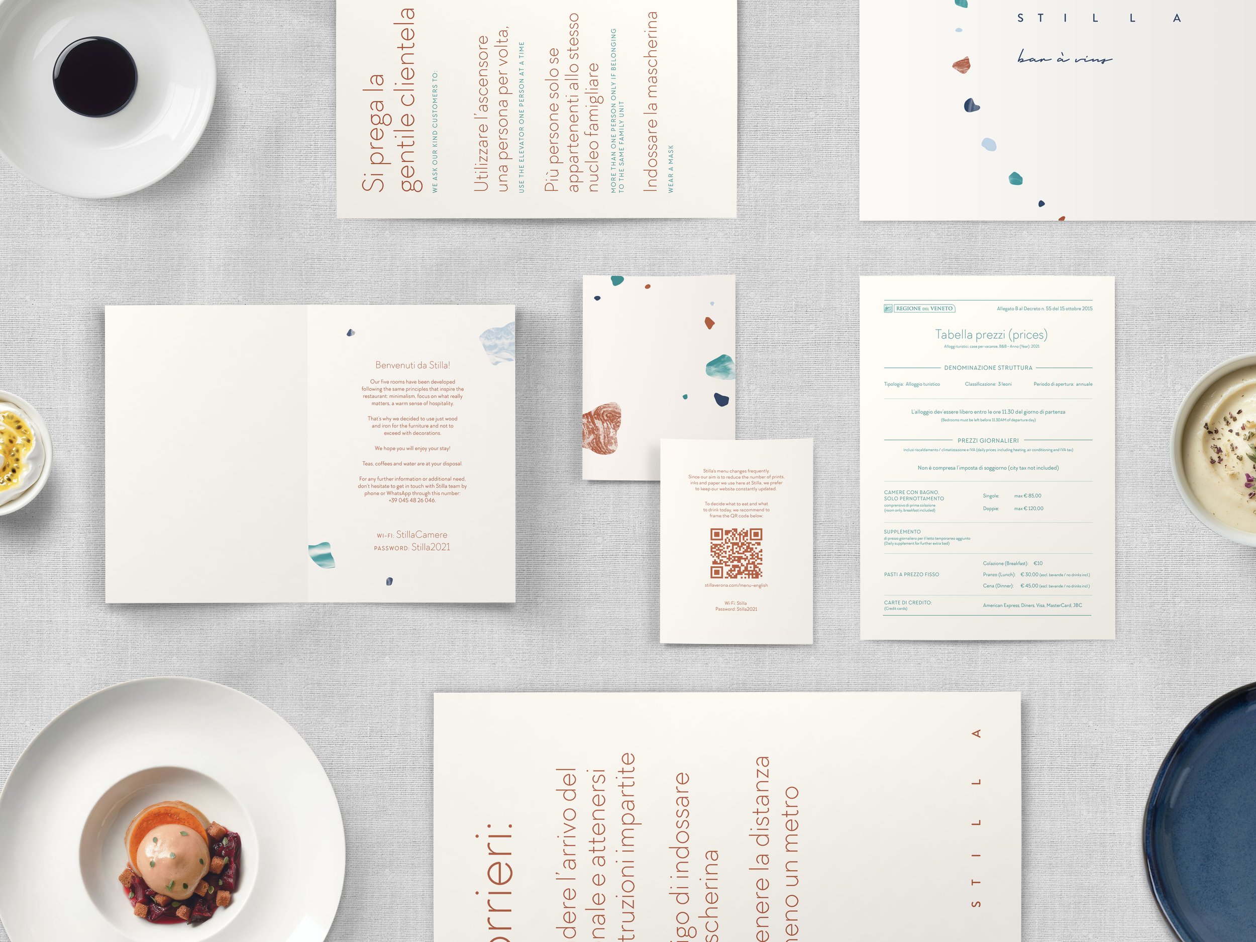
The identity employs a carefully selected color palette inspired by Stilla's furniture and tableware, with colored typography used instead of black to add warmth and individuality.
Pebble shapes, a recurring element, are paired with photographic textures to introduce subtle grittiness and depth. Minimalist typography, enhanced by generous whitespace and the use of off-white paper, reinforces the balance of refinement and approachability.